
What ever happened to Herb Lubalin, Grapus, Tadanori Yokoo, Ken Adam (the Dr. Stranglelove/James Bond set guy), Kate Gibb, Saul Bass, Shinro Ohtake, Keiji Ito, Willy Fleckhaus, and all those Polish poster artists?Being a designer used to mean you drove a Benz and you could get good drugs. Now it means you own a computer. What the fuck? You start out thinking you're going to blow people's minds with your incredibly unique take on the beauty that surrounds us all, and by the time you actually get your career in motion you're essentially a wedding photographer chained to a desk.It starts in design school, where they have so few computers they make you learn Microsoft Word forever under the pretense that you're "getting the foundations." By the time you graduate, the little bit of software knowledge you did get is totally out-of-date (even as I write this Quark is getting phased out to make room for InDesign). You think you can reverse all this drudgery when you make your first club flyer but that's when the pain really sets in. You see, your ideas don't mean shit to the client. He couldn't be bothered learning how to use a computer, so what he wants to do is use you as a human paintbrush. Any idea you come up with, no matter how mundane, is going to be further bastardized by his shitty Guido taste until the final result is a perfect example of everything you hate. There, you got into design as part of the solution and now you're just another part of the problem. Still want to learn more? OK, if you fucking insist…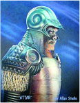 AIRBRUSHWhere would design be without this magical artistic instrument? Best known for those shitty desert shadows in the original Star Wars and that fun "Rasta Bart" shirt you got in Jamaica, the airbrush is practically never used anymore but leaves behind a strong design legacy: Yes covers and the hottest gas tanks and Civil War dioramas. They used to be responsible for the worst art on earth until CGI came along and forged a whole ‘nother level of barf.BORDER LINEIn the world of layout design, this is a way to enclose an image that feels like it's falling off the edge of the page. It's also a polite way of saying that your friend's illustration of a monkey face-fucking a baby is "a little harsh."CROPPINGCropping is the holy grail of design. Got a shitty photo? Crop it and stand back: Gold. Try it once and we guarantee you'll be walking around doing that director-hands thing for the rest of your life.
 DROP CAPThese are the large letters at the beginning of paragraphs that act like the pretty special ed teacher by saying "No, silly, start here."
 ERGONOMICSThis is the basis of design for interactive things like furniture or the clapper. It works by saying "If I reach for the couch lever this way and I'm of x height, ergo…" Shit, that must be the origin of the word "ergo." I never thought about that.
 FONTSDespite what French Canadians and Afro-Americans want you to believe, less is more. Vice uses only two fonts (Hector Rounded and Trade Gothic) because they don't want the magazine to look like a fucking pizza pie. As the building blocks of design, fonts act as both a salesman and a buddy, vying for your attention but then backing the fuck off and just chilling. A good font can be slick without wearing this season's colors because it's got stature and has a big family (bold, italic, condensed, etc.). When in doubt use Helvetica.
 GERMANSNot only do the Krauts talk cool and run a lot, but having to attend a mandatory six years in der Clan Crest school means they are ALL good at design. If you need a catchy symbol for your flag, these guys have got it down.
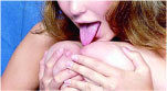 HOOTERSShort on ideas? Toss a couple of tits in your layout for instant wows. Combine with formulas for commercial success. Sorry, but it's that easy.INTERNETThis is where the worst design joins forces with the untapped power of waiting. Your tax guide got you confused? Quick, jump onto our website for the same info buried under a thousand fading boxes.JADEDThis is what you will inevitably become. An endless cycle of updating software makes you into a computer geek. Combine that with Guido furiously pounding your artistic dreams into formulas and what do you got? A bitter, old, robotic nerd. You will hate yourself.
 KERNINGThis is the name for the spacing between two letters. If you've ever stared at a word and said "It spells my name but it doesn't look right and it's giving me a headache," this is why.
 LOGO"Let me get this straight. You're a Wichita-based pedicurist and you don't have a logo? Get with the program and call me back when you're ready for 1993, my friend." Everyone seems to think they need a logo these days. What is graffiti but teenagers converting their nicknames into logos and trying to show everyone.MODERNISMThis is the artistic movement which provides most of the theory (and dogma) behind most design. Apparently three orange squares instead of four are worth millions of research dollars because they can increase sales of Fresca.NEWAs in "endless pursuit of the." Fortunately, there isn't a foreseeable end to how many times the not-so-distant past can be rehashed to make this up.
 OVERPRINTThis is a printing technique mostly used to make sure that when the shitty press you're printing your comic book fucks up and slips, your two colors overlap so there are no white borders around letters. Less boring uses include putting a block of red over a black and white picture for instant "I think he's the bad guy" results.
 PHOTOSHOPThis is not only an essential design tool, it's a crucial media truth serum that has helped uncover both a stuffed puppet's ties to Bin Laden and the real Christina Ricci beneath those pores and short legs.
 QUARKXPRESSThis is another design program, which most magazines use to do layout, and every year, it just gets worse. When people ask why we drink so much at work or "What's with the tears?" we say, "QuarkXPress." We tried to research if it was being coded in Bizarroworld but our support call got cut off while being transferred to India. We're thinking of going back to that blue ink stuff that gives you cancer.RUSHINGLike all artsy-fartsy freelance work, the pay is irregular at best. The life of a designer is rushing to wait and then waiting to rush. The client won't get you all the proper logos until the night before and then, when you're finally finished, the main sponsor's going to drop out. You can tell him to fuck off but you need to eat so be prepared to stay up all night on the 30th to pay your rent on the 1st.
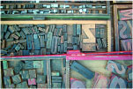 STEREOTYPESBack before computers wrecked everything, typesetters would literally sit there placing each letter onto a press to make your page. This was fucking tiresome, so when you had something that kept coming up again and again like "knee-jerk liberals" you would already have those letters laid out and ready to go. This was called a "stereotype." They may hurt people's feelings but they're pretty handy.
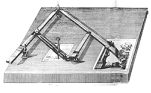 TRADITIONIf you studied design, you got to hear a lot about this. "Back then a business card wasn't a text box in Word—it was AN ADVENTURE. You'd get yourself some rub off lettering (fucking shit, we're out of Ys), a camera, and proper lighting to shoot the film and presto, $1,274 later you've got yourself your name on a piece of card. If you did it right the first time, you'd qualify for a loan to go color."UNDO"HOLY FUCK, UNDO!" In the predigital days, people instead said, "HOLY FUCK, START OVER!" or "HOLY FUCK, YOU'RE FIRED!" If you're a real designer you will find yourself automatically miming "command-Z" every time you spill a coffee or get an STD.
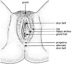 VAGINASPhallic symbols may get first year university students to froth at the Freudian mouth but it's a good design. Who wants to work in a building shaped like a vagina? Ani DiFranco might not like right angles but they work. It's called physics.WEATHEREDAfter years in front of a Mac, a designer ends up looking pretty grim. Your hands are so fucked that picking your nose hurts and you have a neck like a freaky drummer. The "command Z" thing extends itself into losing your pants ("command f —my pants") and you dream about pages that won't close.
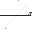 X-AXISThis axis always goes first. If I say it's5 x 8 you know it's 5" wide. In fact, all you have to know is I want the image 5" wide because images are always proportional (never, ever stretch or compress an image) so once you get the x-axis right, y and z can work themselves out (the little bitches).YUPPIESAll those fucking frosted lamps and space couches. Who gave these assholes credit cards? If someone says "Philippe Starck" again, we're torching the nearest Ikea.
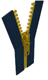 ZIPPERTruly a marvel of ergonomic design, the modern zipper was invented by about 80 guys and nobody was sure what to make of it until 1937 when it beat out buttons in Esquire magazine's "Battle of the Fly." Thousands of miles of zip are produced daily and it remains one of the few truly glorious examples of cheap, simple, and easy design that makes everyone's lives a whole lot better. Those were the days.
Advertisement
Advertisement
Advertisement
Advertisement
Advertisement
Advertisement