

Presented by So you’ve made the decision to start investing, and now you want to track how your companies (and your money) are doing. When it comes to stock charts, up is good and down is bad, right? How complicated could it be?You’d be surprised. First off, they come with super twee names like “candlestick” and “mountain chart” which are delightful and everything, but not particularly beginner-friendly. Then when you actually examine the thing, you’ll find a million different data points all screaming for your attention until you eventually pass out with the falling code from the Matrix dancing in front of your eyes.Yeah, stock charts are weird. But they can be a useful part of your research toolbox when you’re choosing companies to invest in. So let’s do some decoding, before you end up looking like the confused math lady…the blonde doing calculations? Uh, whatever that meme’s called.How to find a stock chartThe daily newspapers all print stock charts, but let’s assume you’re among the vast majority of young people apathetic to the death of print media. Online it is! There are hundreds of free online services available, with Google Finance and Yahoo! Finance among the most popular.There are lots of benefits with going digital. You can build a personalized dashboard of your portfolio, access it anywhere, and see your stocks’ performance updated in real time. The drawback is that you’re that much more likely to want to make an impulsive decision when something you own takes a dip for a minute. Mentally prepare for this, and have your self-care instrument of choice on hand to stop you.To get started, you’ll need to know find out the unique “ticker symbol” of your company. This is the acronym that identifies it on the stock exchange. Some companies get real cute with it (Harley Davidson trades under HOG) while others are more straightforward (Dell is uh, DELL). Find your company’s ticker symbol, type it into your web dashboard of choice, and go.Types of chartsProbably best to figure out what you’re actually looking at. There are three main types of stock chart:
Line chart
So you’ve made the decision to start investing, and now you want to track how your companies (and your money) are doing. When it comes to stock charts, up is good and down is bad, right? How complicated could it be?You’d be surprised. First off, they come with super twee names like “candlestick” and “mountain chart” which are delightful and everything, but not particularly beginner-friendly. Then when you actually examine the thing, you’ll find a million different data points all screaming for your attention until you eventually pass out with the falling code from the Matrix dancing in front of your eyes.Yeah, stock charts are weird. But they can be a useful part of your research toolbox when you’re choosing companies to invest in. So let’s do some decoding, before you end up looking like the confused math lady…the blonde doing calculations? Uh, whatever that meme’s called.How to find a stock chartThe daily newspapers all print stock charts, but let’s assume you’re among the vast majority of young people apathetic to the death of print media. Online it is! There are hundreds of free online services available, with Google Finance and Yahoo! Finance among the most popular.There are lots of benefits with going digital. You can build a personalized dashboard of your portfolio, access it anywhere, and see your stocks’ performance updated in real time. The drawback is that you’re that much more likely to want to make an impulsive decision when something you own takes a dip for a minute. Mentally prepare for this, and have your self-care instrument of choice on hand to stop you.To get started, you’ll need to know find out the unique “ticker symbol” of your company. This is the acronym that identifies it on the stock exchange. Some companies get real cute with it (Harley Davidson trades under HOG) while others are more straightforward (Dell is uh, DELL). Find your company’s ticker symbol, type it into your web dashboard of choice, and go.Types of chartsProbably best to figure out what you’re actually looking at. There are three main types of stock chart:
Line chart
Simple but effective. A stock’s past prices are connected with a line, helping you see general trends pretty much instantly. The small vertical lines at the bottom tell you the “volume,” or how many shares were exchanged. A higher volume line means more trades.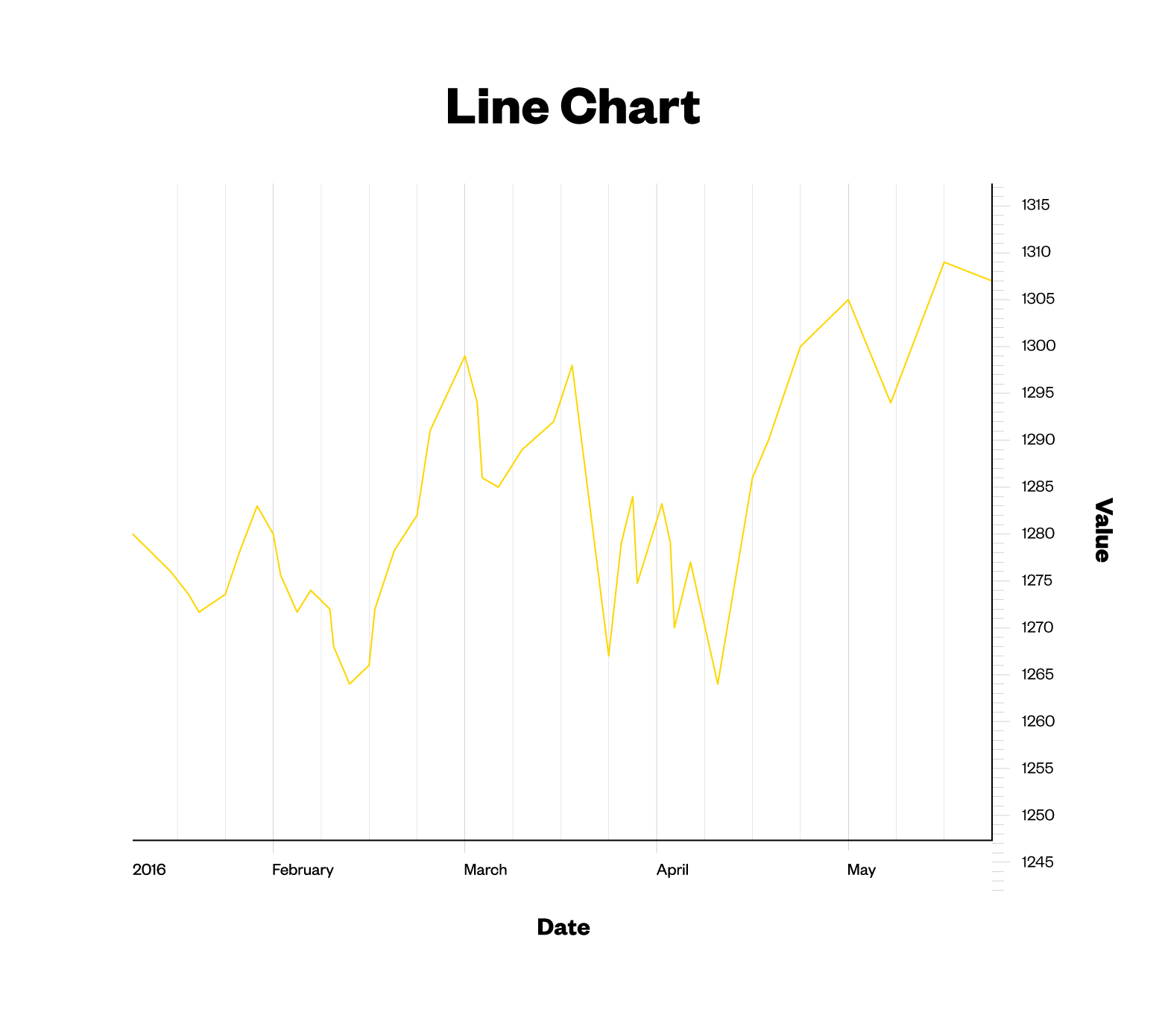 Bar chartPopular with technical analysts.The top and bottom of the vertical line tells you the highest and lowest price the stock traded at during a particular time. On the left side of the bar, you’ll find the stock’s initial price when the market opened for the day (called the “opening price”), while the “closing price” is on the right.
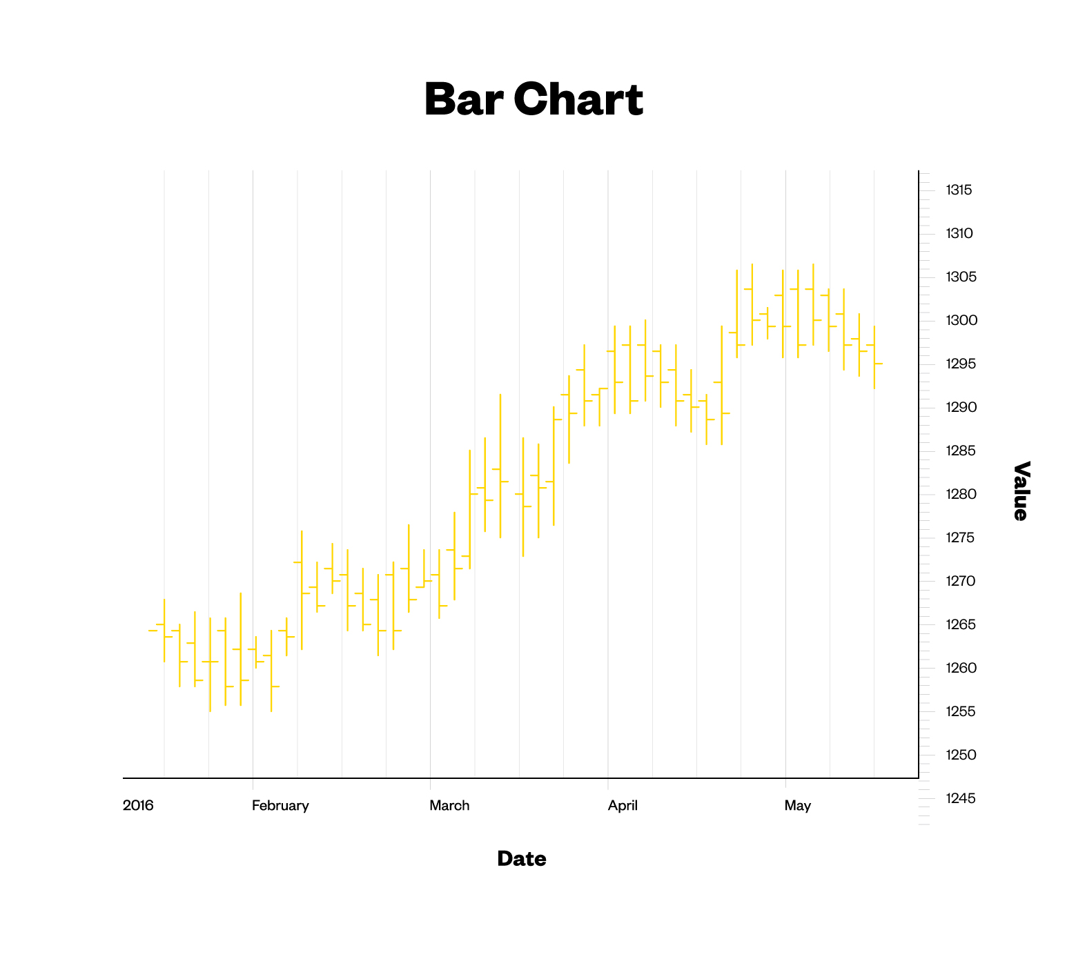 Candlestick chartThese are like a combination of line and bar charts. The candlestick’s widest part is colour-coded to tell you if the closing price was higher or lower than the opening price: Black or red means lower, white or green is higher.
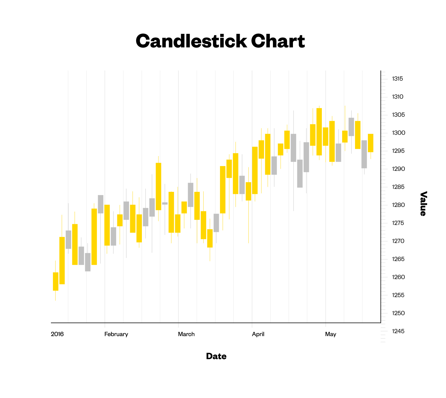 If you really get off on data visualization (and who doesn’t?) you can also get into “open-high-low-close,” “mountain,” and “point-and-figure” charts. But no matter what kind of chart you go with, each one will be broken down into different time frames — up-to-the-minute, daily, weekly, monthly, or annually — and show you the stock’s price and trading volume, which is really all you need to know.
So what do I do with this information?
It depends on what you’re looking for. Let’s keep it simple and say you’re investigating a stock to buy, or doing a general check-up on how something you own is performing.
Step 1: You’ll want a broad sense of how the company’s been performing. Select a “six-month’ view. Look at the prices. Look at the line connecting them. Is this a happy looking, upward-slanting line? Boom, this company’s prospects seem to be in good health.
Step 2. Watch for anything erratic, like a massive spike upwards or downwards. Maybe the CEO left the company? Or there’ve been whispers of an upcoming merger? You’ll want to do some investigating so you can better predict these spikes in the future.
Step 3. Compare your company’s chart against some competitors. If every video game manufacturer in North America is on a downward trend, the issue is probably with the market, not your company. Figure out what’s going on, and if you need to alter your strategy
Step 4. Remember, we all know from playing flip cup that past performance doesn’t guarantee future results. It’s easy to spend hours staring at stock charts and convince yourself you’re a financial Nostradamus, when really, investing in solid companies and checking in on them every couple of weeks is all you need to be doing. So use stock charts to inform your investing strategy, but please don’t go all Aronofsky with it.
If you really get off on data visualization (and who doesn’t?) you can also get into “open-high-low-close,” “mountain,” and “point-and-figure” charts. But no matter what kind of chart you go with, each one will be broken down into different time frames — up-to-the-minute, daily, weekly, monthly, or annually — and show you the stock’s price and trading volume, which is really all you need to know.
So what do I do with this information?
It depends on what you’re looking for. Let’s keep it simple and say you’re investigating a stock to buy, or doing a general check-up on how something you own is performing.
Step 1: You’ll want a broad sense of how the company’s been performing. Select a “six-month’ view. Look at the prices. Look at the line connecting them. Is this a happy looking, upward-slanting line? Boom, this company’s prospects seem to be in good health.
Step 2. Watch for anything erratic, like a massive spike upwards or downwards. Maybe the CEO left the company? Or there’ve been whispers of an upcoming merger? You’ll want to do some investigating so you can better predict these spikes in the future.
Step 3. Compare your company’s chart against some competitors. If every video game manufacturer in North America is on a downward trend, the issue is probably with the market, not your company. Figure out what’s going on, and if you need to alter your strategy
Step 4. Remember, we all know from playing flip cup that past performance doesn’t guarantee future results. It’s easy to spend hours staring at stock charts and convince yourself you’re a financial Nostradamus, when really, investing in solid companies and checking in on them every couple of weeks is all you need to be doing. So use stock charts to inform your investing strategy, but please don’t go all Aronofsky with it.
Advertisement
Simple but effective. A stock’s past prices are connected with a line, helping you see general trends pretty much instantly. The small vertical lines at the bottom tell you the “volume,” or how many shares were exchanged. A higher volume line means more trades.
Advertisement